THE SENSUOUS LINE – THINKING WITH THE PENCIL
The objective of the Renaissance draughtsman was to create the illusion of three dimensionality on the two-dimensional surface of the paper. The purpose of a line, in classical figure drawing, is to describe the form. A one-dimensional line with a fixed width does not do that very well. By varying the angle of the pencil, and the pressure applied to the paper, you can draw a dynamic line that describes the form. Your pencil must have a long tapered point for this. And you will need to learn to vary your grip on the pencil.
We were all taught in elementary school how to hold a pencil in order to make clear, uniform letters and numbers. Unfortunately this is the same pencil grip most people use when drawing. It is a perfect grip for maximum control of a uniform, one-dimensional line. But it is a printing or writing grip, not a drawing grip. It is not suitable if you intend to lighten, darken, broaden, or make narrow the stroke as you move the pencil across the surface of the page. For the line to breathe you need to be able to spontaneously vary the pressure and angle of the pencil. There are an infinite number of ways to hold a pencil to maximize line variation. A fluent draughtsman needs to push that envelope so far that the envelope disappears. The descriptive line is a proxy for your sense of touch – it is sensuous and fluid. Why limit yourself?
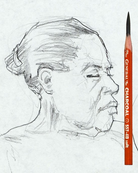
The goal is to think with the pencil, letting it explore the forms. For example, in the portrait sketch above, you can see the very light lines in the center area of the forehead, where the pencil is moving across the form looking for something specific to describe. When it finds something specific (an excuse to define a form), like the brow or the hair, the pencil must then bare down a bit, and drag at the correct angle to the paper, to make a line that is appropriate to the form being described. For her right eyebrow and the tone describing the hair, the broad side of the pencil point was used to make a broad stroke – in both cases the stroke begins darker (more pressure against the paper) and ends lighter (less pressure against the paper). As we learned when discussing light and shadow, “all tones gradate”. The same is true for lines (all lines!), if your purpose is to describe form.
The line describing the front of her right cheek is tapered where it starts near the corner of the nostril. Because the crease between the forms it is describing is deeper toward the top and less deep at the bottom, it gradates, starting darker, then getting gently lighter as it progresses down the face, tapering off again as it discretely disappears into the flesh near the corner of the mouth. The very pointed tip of the pencil was used here. It would be more challenging to draw this delicate line while holding the pencil with a conventional, elementary school printing/writing grip. It would be nearly impossible to make the variety of lines in this sketch with a pencil that did not have the long tapered point shown here.
This drawing was done with a 4B charcoal pencil. The higher the number the softer the charcoal. A 4B is medium soft. Because soft charcoal requires less pressure to make a darker mark, it makes for a pencil which is more responsive to a light touch. A harder charcoal pencil requires a firmer, steadier pressure, which reduces responsiveness, but is easier to control. The difference is like that of a sports car and an SUV.


